Green on dark
Primary
The primary combination for branding on a dark background. The green signature brings energy and recognition.
Download green logo

Jason Mohab-Ali
A recognisable signature. A clear direction. This is the visual foundation for everything I create, share and build.
Build. Learn.
Grow.
The original brand overview. The guidelines below make it practical.
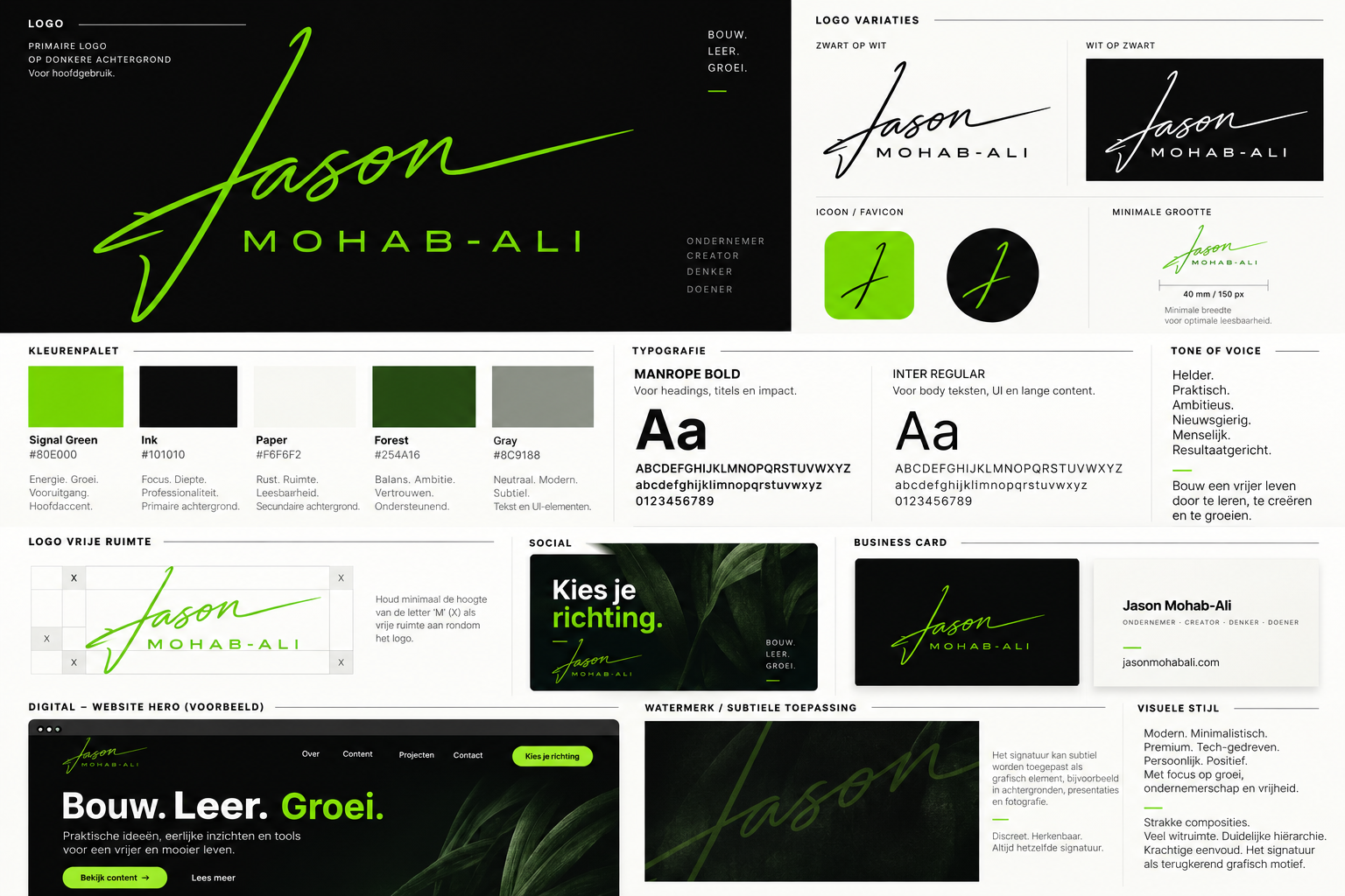
The original logo stays intact. The background determines which version to use.
The primary combination for branding on a dark background. The green signature brings energy and recognition.
Download green logoThe standard choice for this light website, documents and calm backgrounds. Clear and instantly recognisable.
Download black logoFor a calm monochrome application. This display uses the black original with a white display colour; the download file is unchanged.
Five consistent colours. Green draws attention; Ink and Paper give the work room.
#80E000Energy. Growth. Progress. The main accent.
#101010Focus and depth. Main text and dark brand surfaces.
#F6F6F2Calm and space. The foundation of the light website.
#254A16Balance and ambition. For supporting accents.
#8C9188Neutral and subtle. For decorative elements.
Use Ink on Signal Green and Paper. Use Paper on Ink or Forest. Small text on Paper uses Ink or Forest; Signal Green and Gray are not text colours there.
View the brand filesManrope and Inter. Together, direct, modern and easy to read.
For headings, titles and impact.
ABCDEFGHIJKLMNOPQRSTUVWXYZ
abcdefghijklmnopqrstuvwxyz
0123456789
Headings · weight 700
For body text, UI and long content.
ABCDEFGHIJKLMNOPQRSTUVWXYZ
abcdefghijklmnopqrstuvwxyz
0123456789
Text · weight 400 · minimum 16 px
Tone of voice
Clear. Practical. Ambitious. Curious. Human. Focused on results.
Build a freer life by learning, creating and growing.
A direction for the brand. An invitation to take action.
In practice
Clean compositions, generous space and clear hierarchy. The signature returns in everything from a small business card to a big story.
The applications shown here are design examples.
Choose your
direction.
One message. Plenty of space. Green highlights the word that deserves attention.
A strong front and a calm reverse. Each piece of information has its own place.
Room to
grow.
Use the signature as a graphic element behind a presentation or image. Keep the foreground readable.
The original files, with transparent backgrounds for both logos. Always use the appropriate version.
Version 2.0 · 14 October 2026 · Original files by Jason Mohab-Ali.
From guideline to design
Use this guide as your starting point when creating something for this brand. The relationship between words, images and design matters more than any single element. Review each design as a whole, in the format in which it will be viewed.

Decide what the reader needs to understand and what action follows. Then choose content and visual emphasis that support this.
Work with the logos, colours, typography and image style shown here. Leave space around important text and use accents with purpose.
View the design on its intended screen or format. Check readability, contrast and the balance between text, images and space.